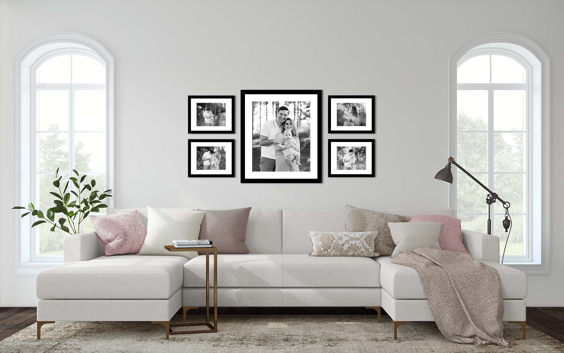
Alme Design Co. is based on the beautiful North Shore of Wisconsin and offers all levels of home staging specifically tailored to the demographic of the intended buyer. They are the largest staging company in Wisconsin and have staged over $250 million in homes since 2017! Alme Design Co.’s extensive warehouse allows their team of designers to create a staging plan like no other. Their goal is to make a house look its very best for a quick sale.
Alme Design Co. also works with their clients to curate beautiful, livable homes with the help of their talented design team. They love all parts of design – from small room refreshes to planning selections for a new build. The Alme Design Co. team excels at taking your style and translating it to a space you love.
Today, I’m thrilled to introduce you to Alme Design Co.’s Director of Operations, Jodi Kurtz. Not only is she an integral leader in this amazing company, but she also happens to be a dear friend of mine. Whether it’s conceptualizing rooms, creating complex furniture arrangements, or teaming up with local artists to create fun and colorful statements, Jodi is known for her impeccable taste and architectural eye for home design. I was excited to sit down with her and gain some knowledge to share with you about creating your photo wall (from a designer’s perspective)!
Megan Papachristou (MP): What is your approach to designing a photo gallery wall?
Jodi Kurtz (JP): First, I begin by deciding on the style or look I’m trying to achieve. Am I trying to achieve a modern, streamlined look, or something more eclectic? Once general ideas of style are achieved, I look for pictures to pull inspiration from. Next, we start collecting pieces based on your inspiration and style.
Play around with the pieces you love and remember, you can build on your wall as you find things you love! Start with the center and build out.
MP: Are there “guidelines” to designing a photo wall? For example, how high should you place a piece?
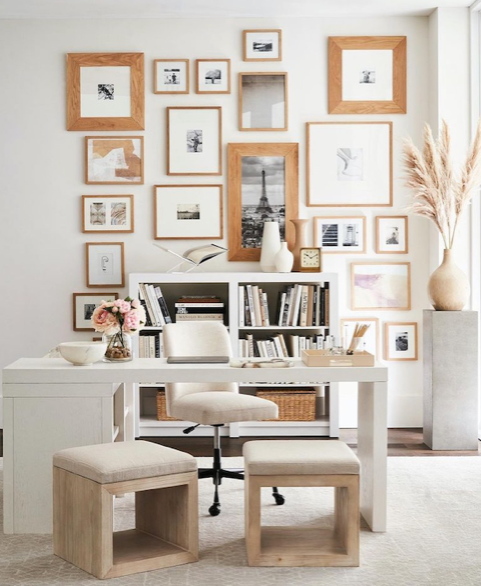
JK: There are so many different styles of gallery walls, and it depends on what direction you choose to take. For most gallery walls, I would choose one larger piece to place in the middle as your focal point and then build around it. The focal piece should hang around eye level and you can choose to go above or below that with the other pieces.
Take a look at this gallery wall designed by Pottery Barn. The Eiffel Tower piece draws your eye in because it is hung at around eye level and is one of the larger pieces. Then, the Pottery Barn designers built the wall above and below the Eiffel Tower piece.
MP: How do you measure a wall to get the correct size for your piece?
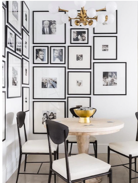
JK: This is a hard question to answer when referring to a gallery wall. You can go as big as you want with a gallery! You can fill an entire wall or have a smaller collection.
This is an example of a photo gallery from Nicole Davis Interiors that takes up a majority of wall space to create an intimate niche. All the photos are black and white to balance the look so as not to be overwhelming.
MP: For the traditionalist, how would you go about adding some design to a wall while staying within their comfort zone?
JK: If you are afraid of looking too eclectic, you could make all the pictures black and white or monochromatic for more of a clean look. Another option would be to choose a traditional matting and frame for each picture to help mix a traditional sense of style with the more eclectic and gathered look of a gallery wall.
This design by House Seven Design shows a more traditional look that is clean lined and monochromatic.
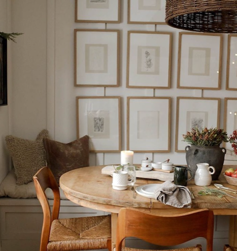
This design sets the scene with a more traditional look. Because of the symmetry of the layout, it looks clean and refined. The sconces above the wall add a special touch that highlights the beauty of the collection.
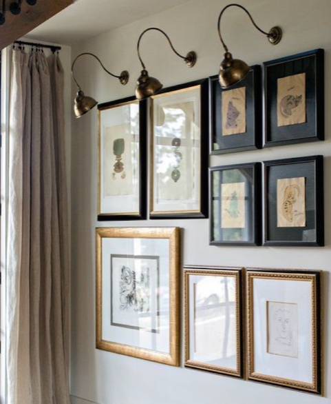
MP: It seems like right now, all the rage is the eclectic mix of photos and design elements. How do you go about even starting to design a wall like that?
JK: If you really want to build that sense of gathered pieces, I would start with collecting pieces of art that catch your eye. Go to an antique store and look for pieces you like; collect items from various sources. Lay out your gathered collection on the floor and start playing around with the arrangement. Once you like the look, take a piece of butcher paper and cut each frame to size then tape it on the wall to make sure you like the look. Finally, make your nail holes.
MP: How do you balance a space with family portraits and artwork?
JK: First, decide what you want your focal point to be. For example, If I want my family portraits to shine, then those are my larger pieces. I would then layer smaller pieces of artwork with the photos.
MP: How do you go about designing a photo ledge, incorporating photos and display elements?
JK: A photo ledge is one of my favorite ways to display family photography. A photo ledge allows you to easily change out photos from year to year.
To mix portraits with other display elements, choose a color theme for the photos and draw from that.
This photo ledge by mStarr design has a variety of pictures and artwork that pull from the same color theme. This design team has mixed sizes and layered items to create the perfect look.
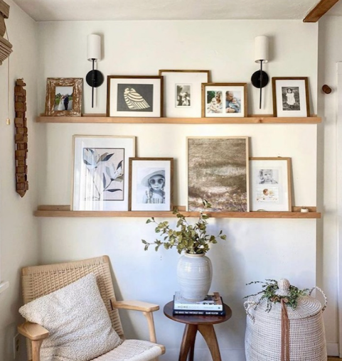
Thanks, Jodi! Make sure to follow along with Alme Design Co. on Instagram.
NAMED ONE OF THE BEST MATERNITY PHOTOGRAPHERS IN MILWAUKEE, WI SINCE 2016!
SITE DESIGN BY EMMYSTUDIO
7405 HARWOOD AVE, WAUWATOSA, WI 53213
Megan Papachristou Photography serves Milwaukee and the surrounding areas including
Brookfield | Cedarburg | Hartland | Mequon | Oconomowoc | Pewaukee | Richfield | River Hills | Waukesha
